UX and UI Design, User Research / Figma / Populus Technologies
Populus Product Design
As the Senior Product Designer for Populus, I was hired to work with with Company Leadership, Sales, CS and Engineering to establish human-centered UX design principles within our ever-evolving product roadmap.
My responsibilities include…
Overhauling our web-app’s information architecture and redesigning the navigation to accommodate our new Curb Manager product
UX and UI Design for all new product features as well as a front-end component library to ensure consistent look and feel
Developing core product user journeys and personas
Leading user research to identify and validate new product roadmap opportunities
Selected Visual Designs
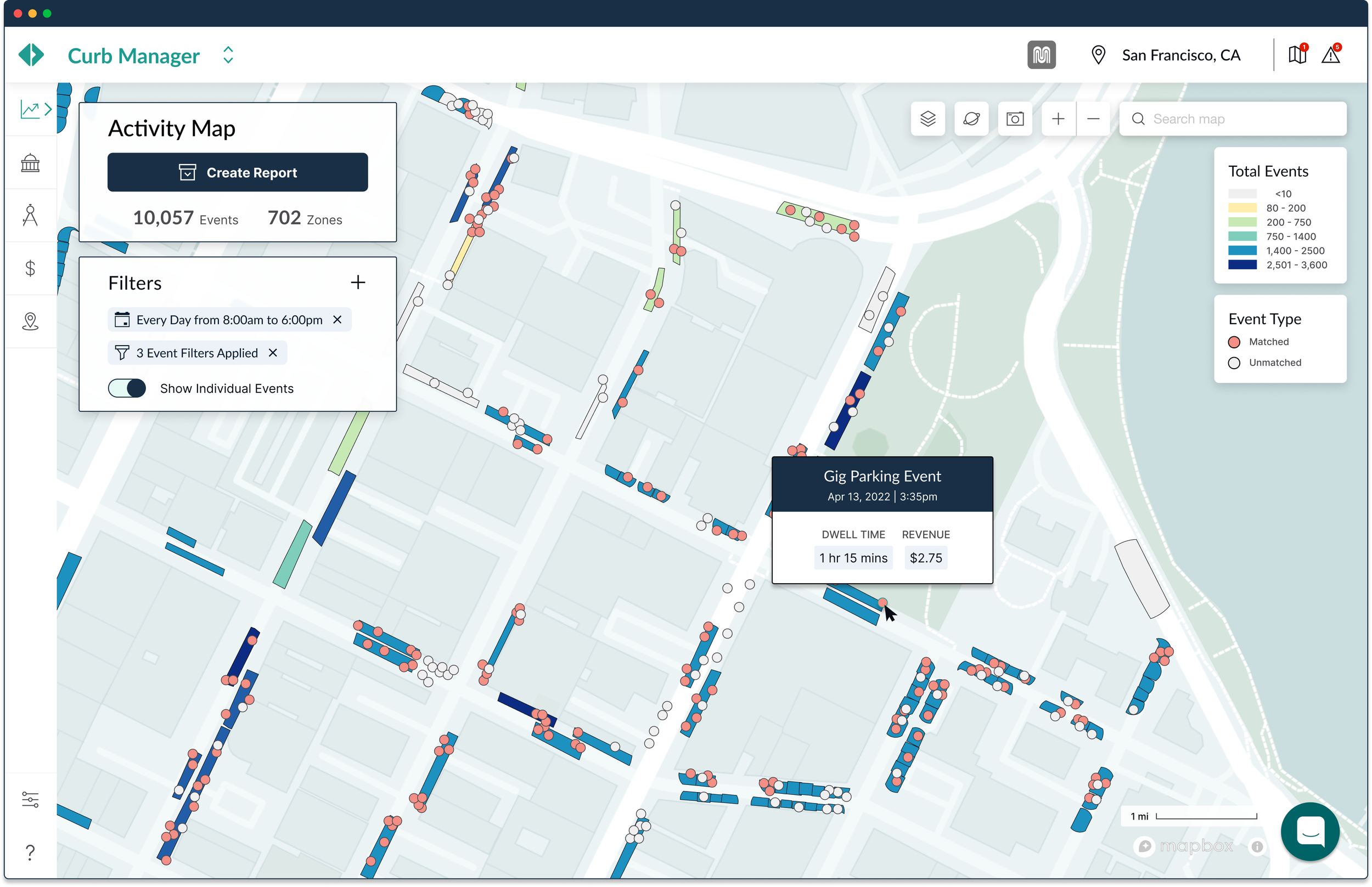
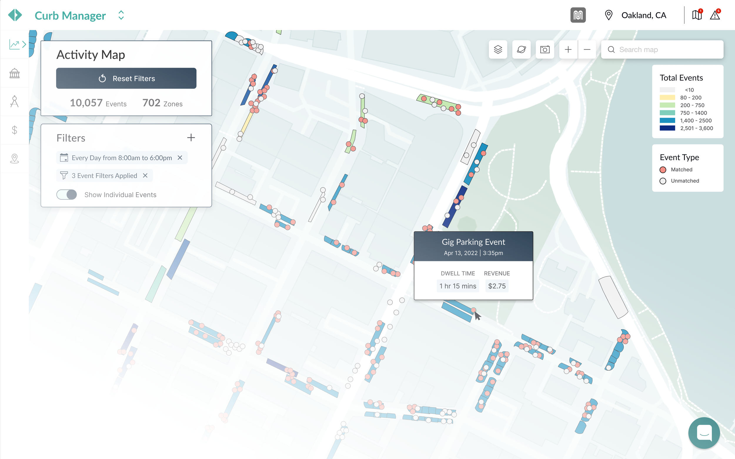
Activity Map | Curb Manager

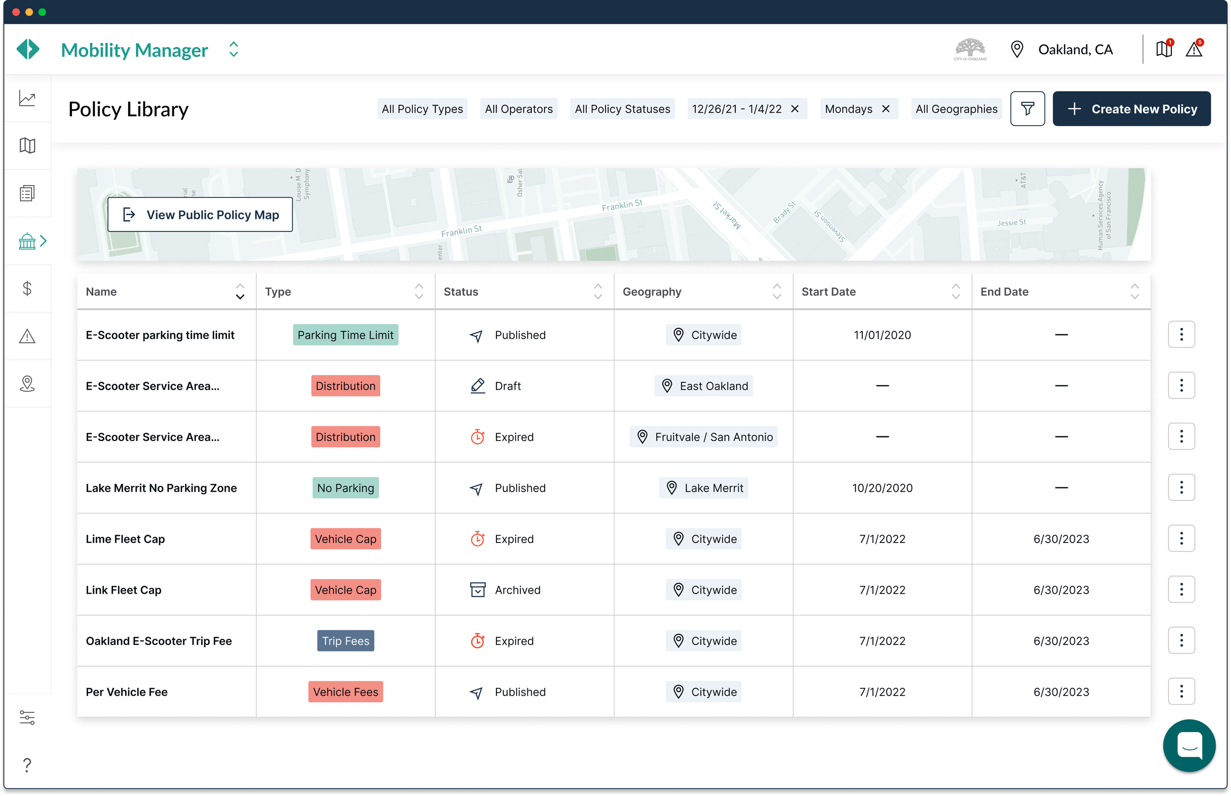
Policy Library | Mobility Manager

Routes Map | Mobility Manager

Live Map | Mobility Manager
(Re)Defining our User Personas
My first step at Populus was to catalogue and analyze our users’ needs and pain points. Over a period of 2 months, I held weekly interviews with our customer success and sales teams to gain an understanding who our users were and translate our existing sales demographics into personas that would inform the first round of updates to the Populus information architecture.


(Weekly User)


1/1/23
9AM
Core User Journeys
Every month I update our user journeys with insights and quotes gathered during weekly discovery interviews with cities. Presenting these during our all-hands meetings and project stand-ups helps keep our team in sync and gives us a clear trail of how pain points evolve in different cities.
Mary, The Program Manager
(Quarterly User)
Policy Details

Adam, The Analyst
(Daily User)
Parking Map

This can’t be right, too many violations on 6th St...

I need average ridership and revenue for this pilot geography...
Reports Dashboard
Data Feed Health

Reports Dashboard

Where are my KPI’s? How do they compare to last quarter?
Sam, The Senior Planner
Monday
How can I get Mary to buy in on this pilot?
I need to compare these data against current programs...
Asset Inventory

Are my feeds up and running?
Are my geofences synced?
4/30/23
Policy Compliance History
Another parking dispute in downtown, I need the compliance history to show to the Lime manager...
Demand Analyzer
Reports Dashboard
Compliance Details
Policies API

The signage team needs updated policies...
Time for the quarterly report…
Friday
6PM
Let’s publish and track utilization for next year...
I need to set up notifications for spikes like this...
Policies API
Information Architecture
Another of my main directives with Populus is to integrate a new product (Curb Manager) into our app. This meant rethinking our information architecture without introducing too much change to our back-end schemas.
Mapping Information Density
The first thing I did was to analyze how primary actions were concentrated on different page types. I cross referenced these ‘information density maps’ with the pain points and feature-requests I had validated in my first couple months at Populus. In addition to identifying the interaction patterns that tripped our users up frequently, the need for a modular library of UI components became clear.
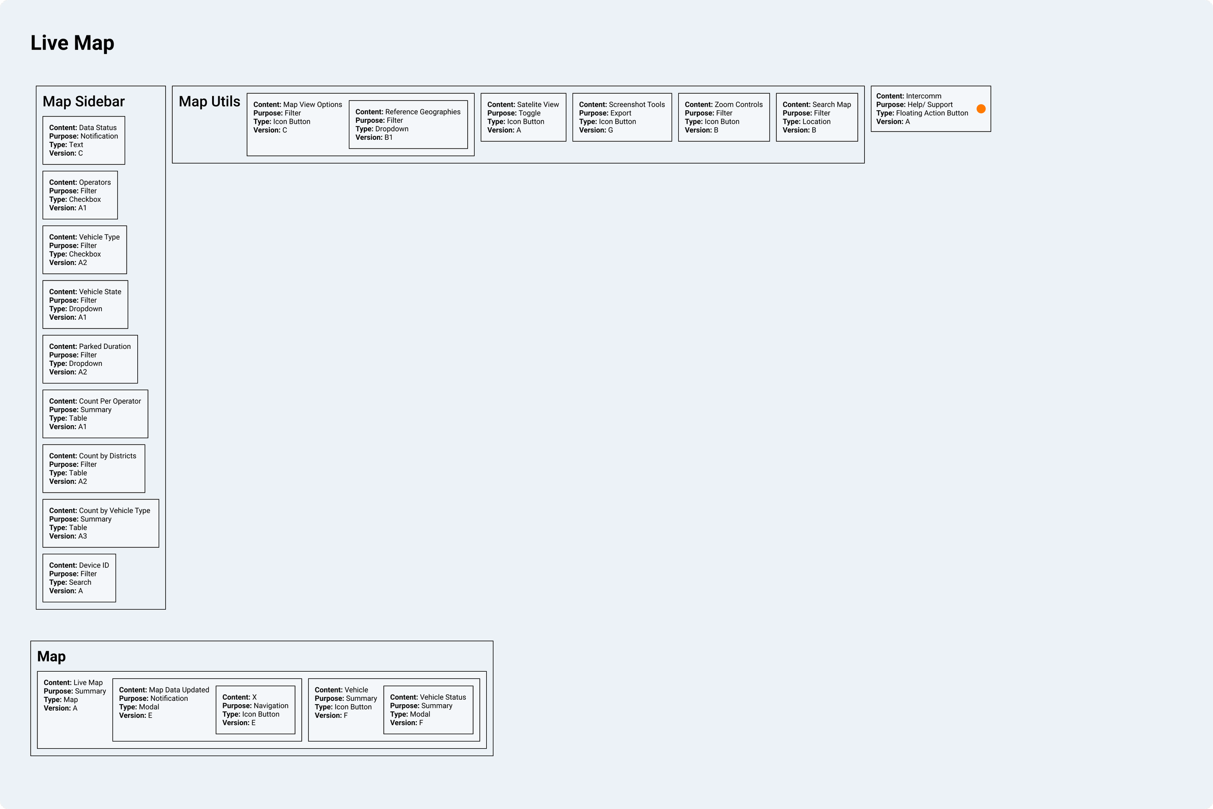
Live Vehicle Utilization Map

Historical Vehicle Distribution Map
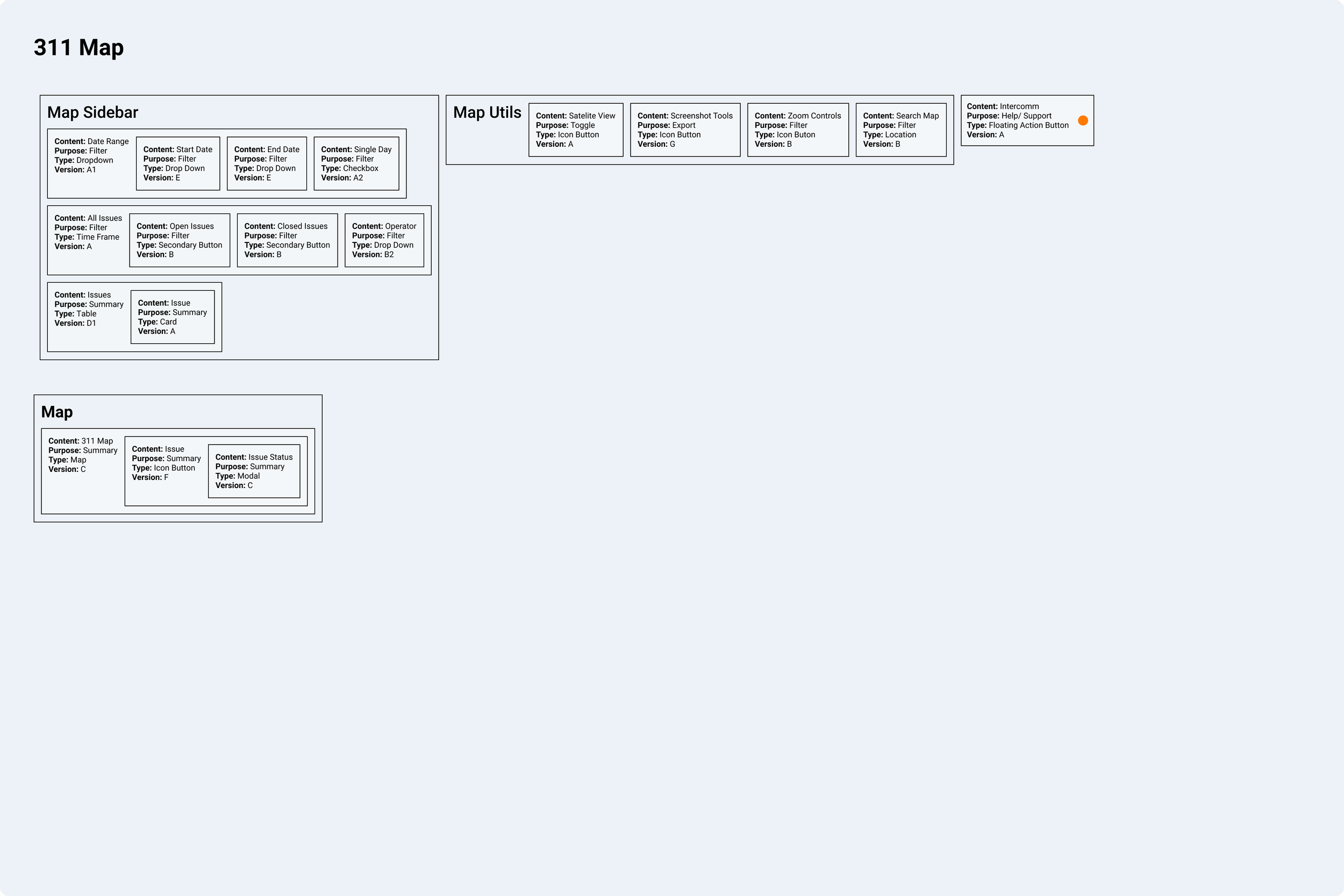
311 Ticket Map
Sitemap

Products and Paths


Curb Manager
Mobility Manager
External Link
Primary Actions

Home
View Notifications
Publish
Invoice
Create Report
Archive
Mapping UI
Navigation Bar Design
428px
1440px

Account tools and regions grouped to emphasize city partnerships with Populus
1440px


Region Name moved to tooltip at 428px
Product and Region Selector

Navigation dropdown hover


Because the same geofences and data feeds powered our entire app, it made sense to locate this in the global navigation bar. This decision was validated in user-interviews.
428px
Region selector moves to popover at 428px
1440px
Data feeds and city map integrations
Dropdown list scrolls beneath search

Dropdown scrollbar hover
Notification Center
428px

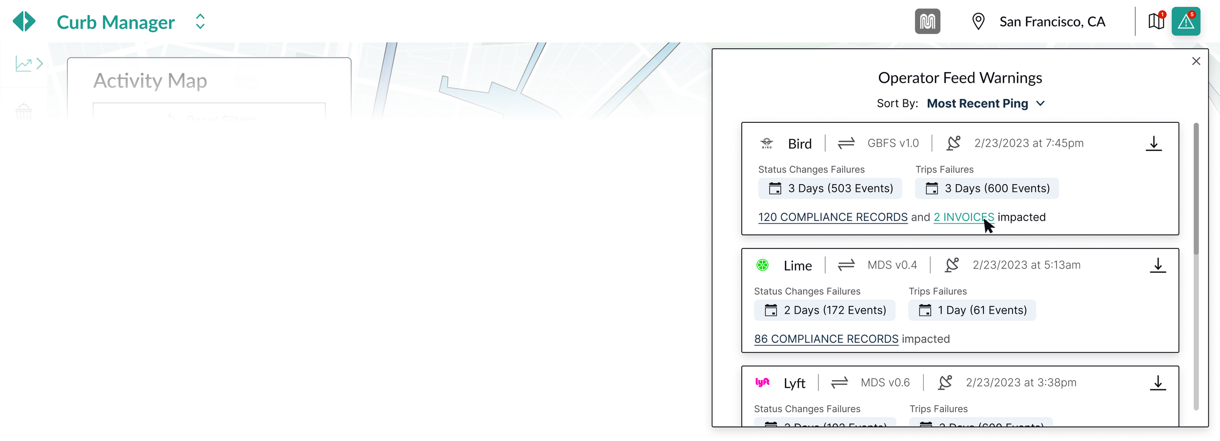

Cities were interested in understanding how updates in their GIS inventory and interruptions in operator feeds were impacting policy compliance and invoicing.

Content Filtering
Maximizing content real estate and a consistent IA
Cities often need to flip between map and dashboard views of the same data to paint a full picture of their mobility programs’ performance.
It was a challenge to maintain perceived simplicity and information hierarchy across these layouts, but we ended our UX research journey with two different filter metephors—for maps, a floating sidebar, for everything else, a sticky header.
(A) Sidebar

CTA’s compete with each other and table contents for heirarchy; limited ability to add table columns; Truncated text in table cells

More map real estate and a higher degree of perceived simplicity; only the date filter is exposed by default
vs.
vs.
(B) Sticky Header
Filters are now 2 clicks away; page template can be easily applied across all non-map views improving overall consistency in page-level information architecture

Lower affinity scores from users; new template would require rebuilding mapping UI from the ground up; operator filters duplicated in map legend