Product Design and User Research / Figma / Populus Technologies for the US Dep’t of Transportation
U.S. DOT Vision Zero Dashboard
Improving Transportation Safety Through Open Data
The U.S. Dep’t of Transportation asked Populus to deliver a predictive dashboard that could help decrease traffic fatalities on U.S. roads. My role was to gather insights into how safety planning was done in 15 different U.S. cities and to create tools that enable cities to understand why crashes happen and how new infrastructure and regulations could help prevent incidents in the future.
By integrating historic and live data describing 80 million trips on shared bikes, e-bikes, and e-scooters, we were able to help more than 15 pilot cities address emerging risks from new modes and patterns of transportation so that they can intervene more quickly to save lives.
Process and Timeline

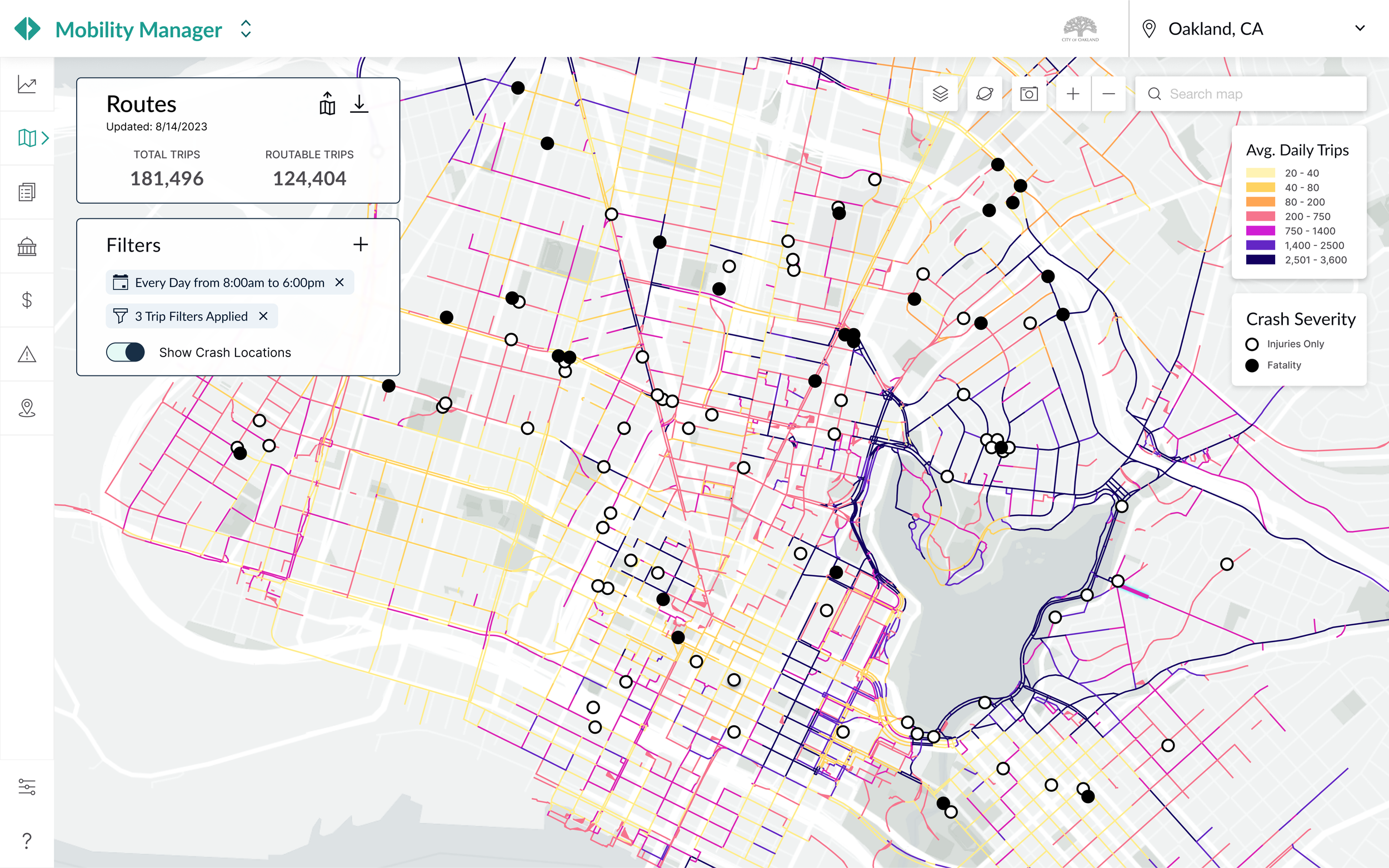
Routes Map - Crash Data Turned On, Route Segment Hover
1 : 1 Discovery Sessions
We had 3 months to get this project done which meant we had time for 2 workshops and some feature validation before we had to get into design and development. My first step was to hold initial discovery sessions with each of our 15 city participants to discuss their individual safety challenges and what their departments’ usual process was for mediating them.

“Comparing crash locations against ridership patterns and street characteristics is crucial to understanding where our infrastructure needs to be improved.”

“We still know where crashes are happening within bike lanes, we just don’t know what vehicles are involved.”

“Visualizing crash hotspots would help inform where to deploy observation studies.”

Participatory Design Sessions
Sketching the Concepts
In order to develop new features that cities would actually use to assess shared mobility safety in different urban contexts, I helped facilitate a series of participatory design workshops. We invited current city planner clients and put out an open call to other planning teams with vision zero programs in development. Key UI concepts quickly emerged from these hands-on sessions.
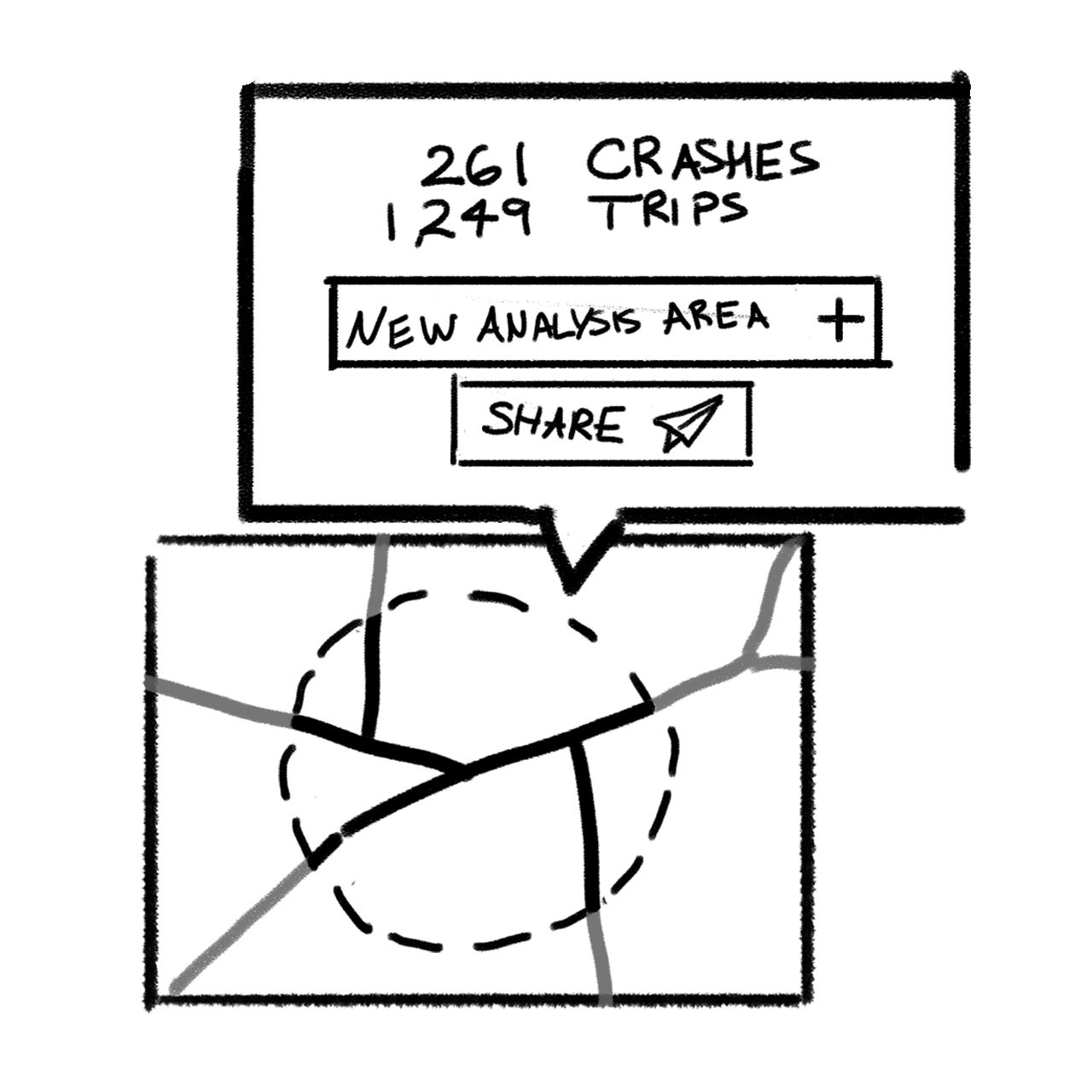
“Lasso Tool”
Analyze custom area without uploading new GeoJSON or Shapefiles….
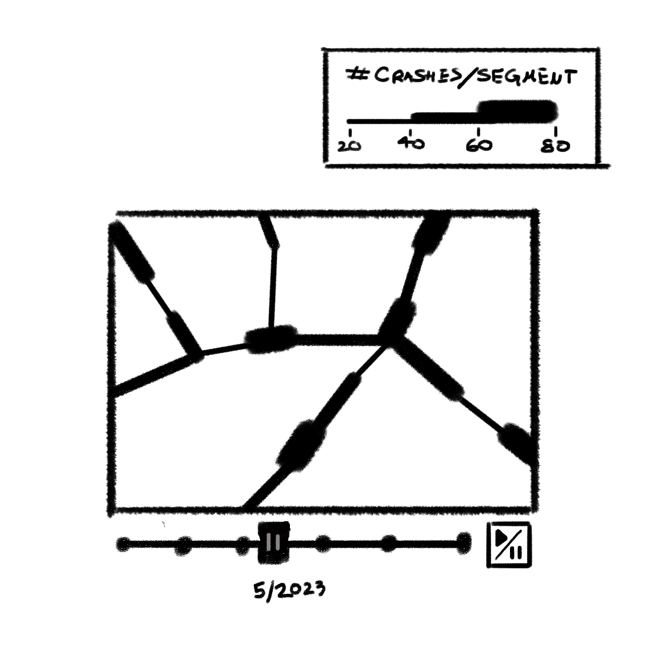
“Animated Time Slider”
Analyze crash Frequency over time…
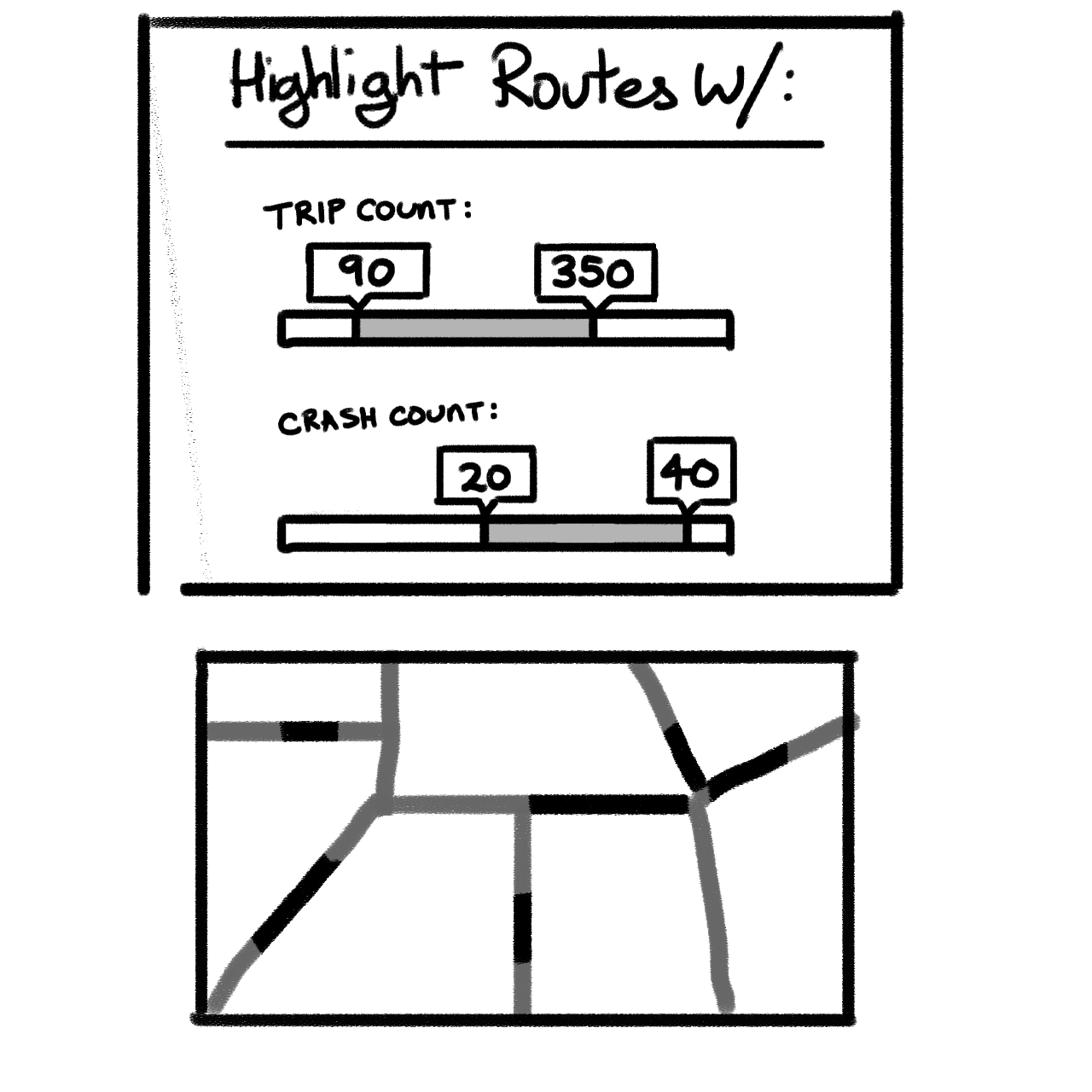
“Hide and Seek”
Fade routes that are outside the filter parameters…
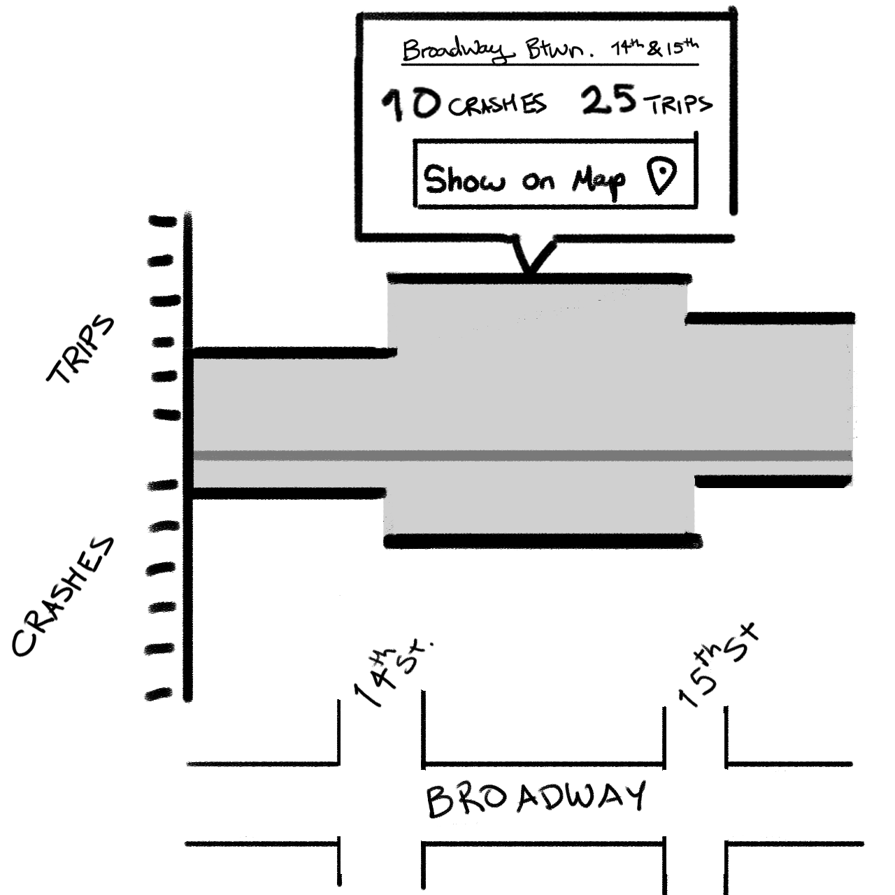
“Route Segment Inspector”
Block-by-block analysis of common trips…
Highlighting the Need for New Infrastructure
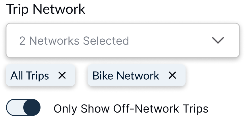
By allowing users to toggle between trips taken on and off existing bike lanes, we were able to show where riders were frequently deviating from planned networks. This Venn-Diagram of rider behavior proved instrumental in helping our 15+ cohort cities identify the need for new safety infrastructure.
All Trips

–
Trips on Safety Infrastructure

=
Common Deviations


Understanding Crash Severity
Popover Prototype

Injuries, Deaths and Vehicle Types
We were able to provide a barometer for crash severity by counting any injuries or deaths and outlining the vehicle types involved.

The ability to pan around the crash location let cities better manage how their staff was deployed to check on potentially hazardous intersections.
Street Characteristics

Predicting Infrastructure Potential


Custom Networks
Cities can upload any route network and see trip counts for the underlying streets. Comparing these counts against points of interest, zoning districts, and other transportation, allows cities to assess the safety implications of any changes to their infrastructure.